Tugg Speedman
I'm trying to take a cue from Swizzle and make a more documented thread here that will hopefully allow me to better explain what there is of my process, or actually think about it in the first place, and look at things with a more critical eye. If anybody else can find something useful here than that would be the best thing in the world. So with that said...
Latest:
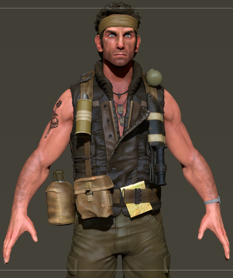
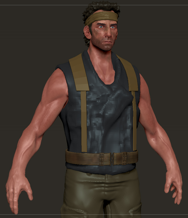
Being a pretty big fan of Tropic Thunder I've wanted to do a good realtime version of some of the characters for a while now. A few years ago I made a pretty mediocre Kirk Lazarous sculpt for GA comp. but rather than trying to just update that and basically make the same model all over again I decided to switch over to the rooster illusion himself, Tugg Speedman.
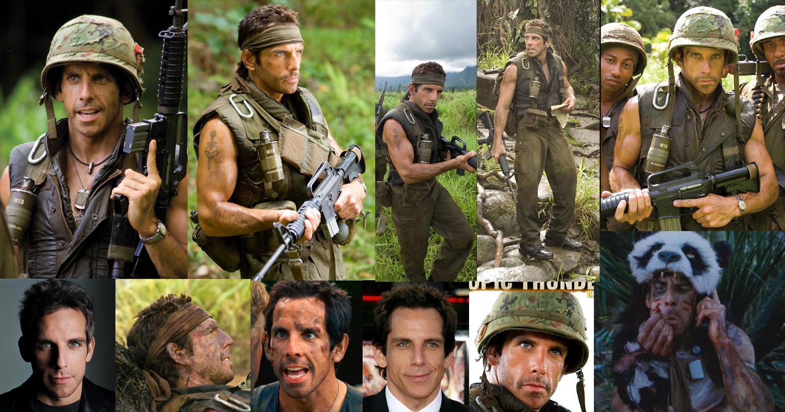
Some of my ref:
A closer look at the webbing he uses throughout the film courtesy of propstore :
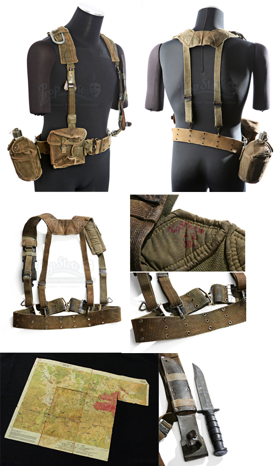
One thing I didn't notice until after I had a fair bit of modeling done on the webbing is that there's actually two slightly different version here. Going through the film the version on the body suit is definitely the one he wears most of the time, you can tell by the horizontal stripping on the belt an single loop clips. The other version uses vertical stripping and double clips which I had already modeled and honestly find more interesting, so I'll be keeping those.
Getting the Likeness:
Getting a proper likeness from a variety of sources is a pretty tricky thing, as lighting, makeup and age all cause slight changes in appearance that can effect how accurately the model is. Here's an example of Ben over the years:
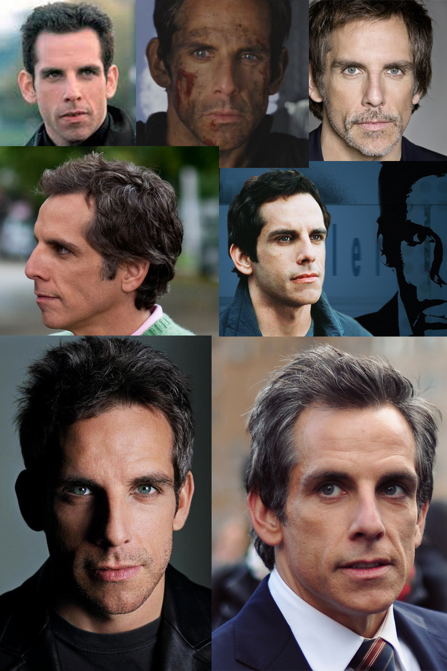
In all the pics there are certain key characteristics that stay the same, The large "caveman" brow that leads to all the muppet jokes for example. While other area's like his cheeks have become more sunken with age/weight loss. While the obvious solution would have been to get as many high res stills as possible covering multiple angles, lighting and facial expressions, especially in the case of a movie likeness, the originals of these ref pics are quite high res and are great for important details like the eyes, ears, etc. At the start of this project I really should have gone through the movie on my comp and screen-cap the necessary ref but hey, the more you know...
On with the model:
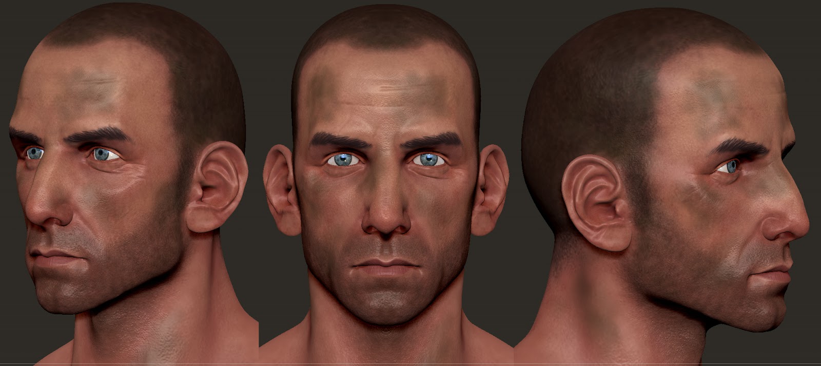
So considering the above points I think I've done a pretty good job of capturing Ben as Tugg here (a friend who hasn't seen the film asked me if it was Ben). However what I don't have down is the right level of realism. I'm not entirely sure what it is but there's a certain amount of stylization going on here that's throwing it off.
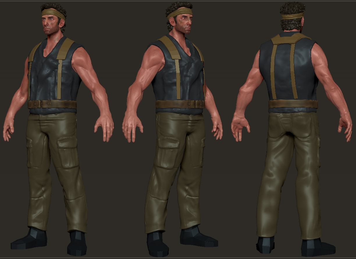
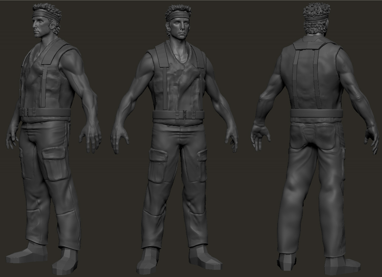
The rest of the pics here are all wip shots of where the rest of the model is at.
P.S. I tend to ramble a little so if things don't make sense or read awkwardly please let me know.
"I think I can spot a prop head when I see one"
Latest:
Being a pretty big fan of Tropic Thunder I've wanted to do a good realtime version of some of the characters for a while now. A few years ago I made a pretty mediocre Kirk Lazarous sculpt for GA comp. but rather than trying to just update that and basically make the same model all over again I decided to switch over to the rooster illusion himself, Tugg Speedman.
Some of my ref:
A closer look at the webbing he uses throughout the film courtesy of propstore :
One thing I didn't notice until after I had a fair bit of modeling done on the webbing is that there's actually two slightly different version here. Going through the film the version on the body suit is definitely the one he wears most of the time, you can tell by the horizontal stripping on the belt an single loop clips. The other version uses vertical stripping and double clips which I had already modeled and honestly find more interesting, so I'll be keeping those.
Getting the Likeness:
Getting a proper likeness from a variety of sources is a pretty tricky thing, as lighting, makeup and age all cause slight changes in appearance that can effect how accurately the model is. Here's an example of Ben over the years:
In all the pics there are certain key characteristics that stay the same, The large "caveman" brow that leads to all the muppet jokes for example. While other area's like his cheeks have become more sunken with age/weight loss. While the obvious solution would have been to get as many high res stills as possible covering multiple angles, lighting and facial expressions, especially in the case of a movie likeness, the originals of these ref pics are quite high res and are great for important details like the eyes, ears, etc. At the start of this project I really should have gone through the movie on my comp and screen-cap the necessary ref but hey, the more you know...
On with the model:
So considering the above points I think I've done a pretty good job of capturing Ben as Tugg here (a friend who hasn't seen the film asked me if it was Ben). However what I don't have down is the right level of realism. I'm not entirely sure what it is but there's a certain amount of stylization going on here that's throwing it off.
The rest of the pics here are all wip shots of where the rest of the model is at.
P.S. I tend to ramble a little so if things don't make sense or read awkwardly please let me know.
Replies
Not a whole lot of an update here but I wanted to get an opinion on the overall scale/head height. I was looking at him for a bit and the body just felt too big from some angles (3/4 in particular)
So the original size is 8 heads tall which felt off/too heroic and then adjusted down to 7 1/2 (the head itself is the same scale in both cases); which feels a little too "squat". Now keeping in mind that Ben Stiller is only 5'6 in real life does this work ? Is it too much of a change? Am I just crazy? What's up people?!?
-UPDATES-
So a lot of overall work the last couple days. Re-did and adjusted the arm anatomy, including crazy-awesome-arm-hair-layerz!
a few small adjustments to the eye's, including eyelashes and completely redone eyebrows.
New pant folds and detailed his boots.
But i do think you should slim down his thickness and broad shoulders. Its a good thing to add some character to the anatomy,but you almost always make your faces,hips and shoulders too wide. Makes it look as if you keep reusing the same basemesh. Im happy this guys face isnt wide heh
I know youre not going for tugg's actual proportions, but i suggest you do.
something along the lines of
http://imgflip.com/i/kcni
Maybe make a anorexic model next :P
Also, in profile, the hook/eagle nose is not as defined as in the photos of stiller.
Great work so far tho! looking forward to see this one progress.
butt_sahib: Good call on width man (I think that's why I thought he too squat as well) I've adjusted that and the wrists some some as well. I always thought my faces were too narrow so that's interesting;)
JohnnyRaptor: haha, I actually just shortened the biceps because I thought the were too long. Moved em back a bit. Spent som more time on the nose too.
the_Adri: hmmm, I know something's off but Bradley Cooper? Really?
Above mentioned tweaks:
Spent a good portion of the last two days working on finishing up the bulk of the vest. Mostly base meshes in maya and details in zb. Still need to add extra pockets, grenades and whatnot's. I might try and throw in the M&M grenade from the chopper scene but not really sure how to go about it other than a lame texture.
God I love Simple Jack.
I really like his jaw line and the face overall. Your killing it with the vest detail too.
Feel free to ignore this but something about his slightly stylized proportions still seems weird to me. I can't place my finger on it so it's probably not much help. I guess I feel that Ben is a tiny dude. That is kinda what makes him funny in this macho role. I don't feel from this model that he is a tiny guy. Possibly it's his larger hands? Or that his vest fits tightly against his skin? Not sure. He just feels "thick" to me. Looks awesome regardless. Keep it up man!
nyx702: That's awesome man, glad you like it:) You're definitely on to something with the hands, and as I've mentioned before, the stylization isn't on purpose. For the body, at least when I look at him, Ben bulked up quite a bit for TT (though maybe less than for Dodgeball)
here and here and while he's probably thinner without the vest I think (for me at least) it's a misconception between the person and the character. Kind of what I was attempting to to talk about at the top.
here's the smaller hands and a bit more poly-paintness:
Finished the basic outfit stuff with a remodeling of the bandanna. It's now a proper piece of folded and looped fabric instead of the lumpy cylinder from previous posts;
Started on the accessories, His duct-taped M18 smoke grenade and M67 "Baseball" grenade:
Found a great wikki for ref here which lists all the weapons used by each character. It's mostly accurate although there noticeable differences in the M18 such as the little "pegs" around the top near the fuse.
So baring any crits, this is the final HP stuff for Tugg, time for LP joy...
--edit: updated pics--
Great work dude, you are getting so good!
nyx702: hmmmmm. I've adjusted the scale of the m18 so it's a bit smaller. I think I may have made it a bit too long and not wide enough, but the ref seems to differ pretty widely (even in the film he has at least two different versions) the other stuff is all pretty big though. I may have the front pouch a little to wide in the Z axis but otherwise it's about the right size.
I've made a couple small changes since last night so I've updated my previous post. Scale of the m18, soem curving in the knife scabbard, and a new haircut the reflects the film better, It'll be alpha cards in the lp. Also replaced the matcap for the unpainted shots.
those thumbs dont look like thumbs, but another index finger of some sort.
cant really explain without a paintover. just look up more hand anatomy and general bone structure of the hand.
also the nails look huge.
Spent some more time on the thumbs and hands in general:
did you by any chance used arshlevon's base mesh as a starting point ? that mesh has the same hand problem.
also, step down couple subd lvl and smooth out the general anatomy. over all it looks a bit too lumpy/bumpy around the palm area.
MM: About the base mesh, maybe? I've been using it for a while and have edited/redone so much of it that I don't really remember where it started. I've adjusted the fingers some more, and tried to account for some of Ben's "stubbyness", also worked on the lumpyness.
adjusted again, the thumbs are at different angles but I think the rest lines up now:
- the skin on the back of the wrist looks like wrinkles in cloth (to me.) I think it might be an attempt at hair, but it needs to be finer (again, IMO.)
- The thumb seems unusually pointy.
- There is something strange about the direction and emphasis of the ring finger, as though the knuckle is more pronounced then the middle finger.
- The wrist bows inward where it transitions into the palm.
Anyways, the project is looking in good shape. I like the polypaint you've got down so far, and in particular I really like the zipper things on the inside of the vest.
Looking forward to more.
ysalex: Thanks for the input, I've made a some more adjustments but don't have an update just now. The hair on the back of the wrist/arm is more obvious with the texture on but I know what you mean.
Bad Hair
So i kind of suck at (realistic) hair, weather it's just in the sculpting phase or the low poly/texture. While I've read tutorials, such as Paul Tosca's Varga and Kevin Lanning's pages from d'artiste Character Modeling 2, as well as a good painting vid/gif a few years ago from either Bobo or Poop. For Tugg, as you'll see below, my own application just seems to miss the mark.
For the style and color I've used the various film reference previous gathered, and for aplha-plane placement/usage some Nathan Drake and Dom Santiago since they have a similar style and length:
(the d'srtiste book has some good wireframes that don't seem to be online)
So with those gathered this is my first pass:
zb, maya, marmoset
The lighting in the marmoset shots is kinda wonky, which I believe is a result of normals direction. All the planes along the top of the bandanna have their normals facing down, while the rest are facing up. The intention was to compensate for backfaces from different angles, but then I went and turned backfaces off in the material settings so I guess that was moot. - The only reason it's in marmoset at all at this point is because I'm using maya 2012 and it shades terribly when transparency is involved. Actually it mostly just sucks straight out with shading on my machine.
And for the texture:
The actual texture is the 1st box with the hair in the bottom left being the sideburns, the bottom right the back of the head/neck, and the top the top. The 2nd is the uv's and the 3rd is the alpha mask.
I'll also note that I hand placed all the planes and can't say I'd recommend it. While there's complete control over placement it took most of a day.
it is good to see you are putting some serious effort on this character, so keep going.
as for the hair, may i suggest giving maya paint effects a try. it is quite fast and all paints have alpha as well. you can create some nice hair cards in matter of minutes.
also, currently your hair card have similar silhouette. try to vary the silhouette of different cards so that your hair doesn't look so uniform.
I spent a couple hours with paint effects to see what I could come up with but wasn't really happy with anything (also not sure how to go about adding the pfx to an existing uv sheet without loosing the quality of the alpha).
What I've done here is created a new set of hair brush presets in ps with some strand and opacity variations, so while it's still coming across abit more Fur-like than Human-hair, I think it's definitely a step up from yesterday. The next step will be to vary the alpha-planes a bit more and probably a fewer but larger ones overall and on the back specifically.
To get a better idea of the effect (without all the gaps between planes) I've done a quick test bake of the head:
It's just a quick UV of one of the lower subdivisions.
actual, diff, spec, alpha:
as for paint effect, i was actually talking about creating a library of PSD files with painted hair strands in a variety of directions. then you can use them in photoshop to create your custom alpha cards any way you like. you would paint directly on a 4k 2d canvas inside Maya and not on any mesh.
here is an example and also few painteffects pointers just in case.
to get to paint effects, go to viewport menu "panel-> paint effects"
there you can just go to "canvas-> open image" if you want to work in a 4k canvas.
you can right click on canvas and click "get brush" to open up the visor
from visor you can select say "hairShortBlack" which is what i used in this example.
then you can edit the brush settings by right-cliking on canvas and "brush->edit template brush"