Pokemon Trainer Hilda
polycounter lvl 11
Hey everyone 
This is officially my first serious attempt at creating a character, and one I have been working on over a long period of time.
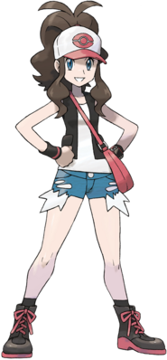
The inspiration was this piece of artwork.
I wanted to create a properly proportioned, somewhat realistic version of her, and here's the result -
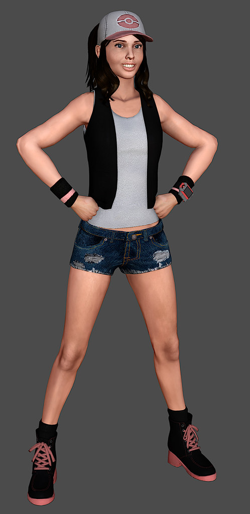

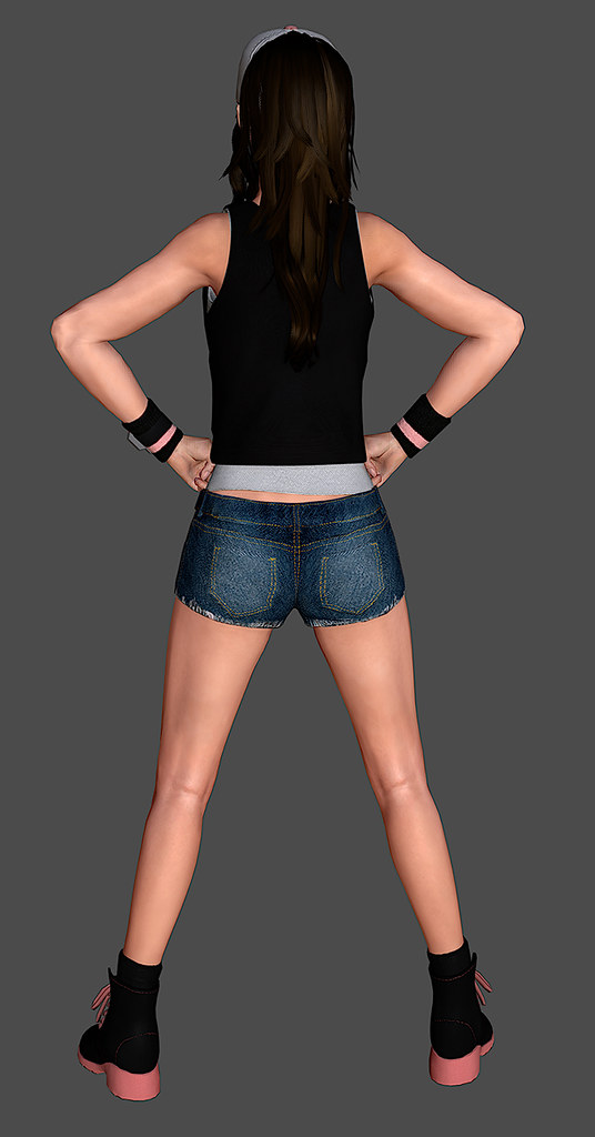
Now, it's pretty much at a finished state, and I have learnt quite a lot. I still consider myself a novice at zbrush, and texturing, and I know there is a certain lack of quality in the detail of the texturing.
The intention of this was to take my time and learn the processes, whilst hopefully having something to stick into my Character Art portfolio.
I would appreciate any comments or crits, especially around the face, because that is something I still plan on tweaking, and something that still strikes me as a bit off, and would love a bit of direction.
Cheers guys")
This is officially my first serious attempt at creating a character, and one I have been working on over a long period of time.
The inspiration was this piece of artwork.
I wanted to create a properly proportioned, somewhat realistic version of her, and here's the result -
Now, it's pretty much at a finished state, and I have learnt quite a lot. I still consider myself a novice at zbrush, and texturing, and I know there is a certain lack of quality in the detail of the texturing.
The intention of this was to take my time and learn the processes, whilst hopefully having something to stick into my Character Art portfolio.
I would appreciate any comments or crits, especially around the face, because that is something I still plan on tweaking, and something that still strikes me as a bit off, and would love a bit of direction.
Cheers guys
Replies
some crits:
The anatomy and face look good, mouth and eyes need some work though.
As for the clothes/textures; The black is too flat, either bump up the spec or brighten it up in the diffuse.
The jeans seem a bit too saturated and noisy and it looks like there's some stretching.
The shirt has too much surface detail and it's missing the border at the collar and maybe some stitching at the bottom.
The shoes, hat and wristwatch look nice but again, the textures are too flat and lack detail.
Good job, hope I helped.
On her original design, there's some weird, white things sticking off her short jeans. Perhaps you could indicate these as like, the pocket liners sticking out from under her now very short cut off jeans?
I did have a mess around with the specularity of the clothes, but I was quite conscious that I didn't want them to look too shiny. I'll probably brighten up the black just a tad and perhaps experiment more so the blacks don't get lost.
Could you be a bit more specific about the eyes and mouth please?
I decided to omit the pocket lining mainly because it couldn't get it to look like the ones in the art. I could just stick on normal ones and see how they look. Hopefully I've got space somewhere in my UVs
Thanks for the comments guys
Her face, particularly the mouth, looks off. And her knees are very rough/old looking.
I've mainly been tweaking her face, and trying to get a more natural look. It certainly sticks out more after not looking at it for a long while.
Here's a before after pic (or after/before in this case)
Unfortunately, and this was mainly due to my destructive way of working, a lot of the issues I had with textures I was unable to go back and make any major adjustments. (I polypainted most of it on zbrush, which attributed to some stretching on the jeans for instance). And I'll be away from home over christmas, so no more work
I do have another project lined up after Christmas, and I will definitely be posting up a step by step progress on Polycount, so I can sort out the major issues earlier on
Thanks for your help guys, it's really appreciated.
Here's how she's come out -