Home 3D Art Showcase & Critiques

[UDK] Water Temple Environment

polycounter lvl 12
Offline / Send Message
RogelioD polycounter lvl 12
Hello once again! For the next week or so I will be working on this environment based off a God of War concept. The concept is just a jumping-off point for the final piece, but right now I am finalizing proportions and quading out geometry for import into Z-Brush for sculpting.

So basically what you see here is hasn't been UV'd at all, the lighting has far from even begun, and there are some smoothing errors here and there. Feel free to critique and comment freely, feedback and failure is the only way to become a better artist!

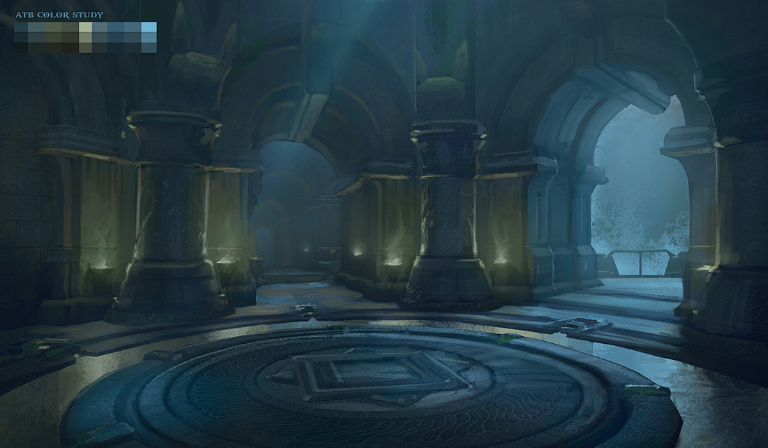
Here is the concept:
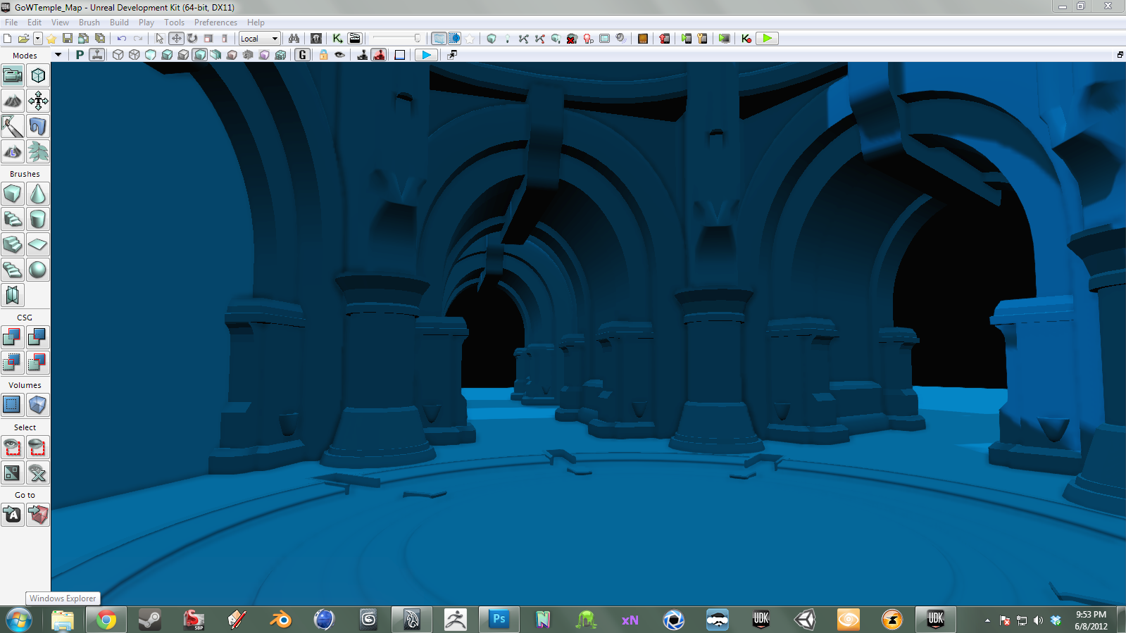
concept01.png

Here is the WIP:

WIP01.png

Replies

  • RogelioD
    Options
    Offline / Send Message
    RogelioD polycounter lvl 12
    Update!

    I have UV'd all of the base meshes and made high poly versions for import into Z-Brush!

    Spending all day tomorrow sculpting and baking!


    WIP02.png
  • RogelioD
    Options
    Offline / Send Message
    RogelioD polycounter lvl 12
    Newest update!

    Added:
    *DOF
    *Atmospherics
    *Emissive Lighting
    *Water Shader w/ Reflections
    *Pillar Normal Map

    Everything else is sculpted but working on baking maps at the moment!

    Also, SSAO Was a bit much, so I took it out for now. I remember there being a way to adjust it's setting but I can't completely remember at the moment. Does anyone know how to adjust SSAO settings?


    WIP03.png
  • S2Engine
    Options
    Offline / Send Message
    S2Engine polycounter lvl 10
    Cool, I like where this is going, a very nice concept to work from indeed. I'm not so sure you need the rim shader on the pillars, or at least not as strong because it's popping them out a bit too much from the rest of the environment. Depth of Field is also a little much, I think you could push back the start distance further so that it starts to kick in halfway down the hall or thereabouts. I think you've got scale very close to the concept which is good, but looking at the color in the image it's much darker and more dramatic. Part of that is lighting (there needs to be less of it), but part of that is simply that you're using a light base color for your default material. I'd bring that down to a darker tone more in line with what the stone colors are, and it should start to feel closer to the concept. Finally I'd say try to get those last open areas blocked off even with just some temporary mesh to keep it from going off into the void; it can really make the difference in how your eye reads the image. Great start, looking forward to more!
  • RogelioD
    Options
    Offline / Send Message
    RogelioD polycounter lvl 12
    @S2Engine Thanks for the feedback! After this update I am completely redoing all the lighting to hit on that dramatic feel you mentioned.Also, good call with that open area, it's something I was meaning to get to and then kinda completely forgot about- which is the exact reason I post! Thanks for that, I will be deciding today what should go out there since it isn't completely discernible from the reference.

    But, before I completely redo my lighting for more dramatic effect, here is an update!

    WIP04.png
  • RogelioD
    Options
    Offline / Send Message
    RogelioD polycounter lvl 12
    Lighting update! Tried to go for a more dramatic feel. Still messing around with things here and there.

    WIP_05.png
  • RogelioD
    Options
    Offline / Send Message
    RogelioD polycounter lvl 12
    Last update for the night, all lighting.

    Decided to stray away from the reference a bit and give the lights more of a complementary orange feel as well as make the lighting even more dramatic.

    I've worked on this non-stop for the past 3 days so I think a tiny break is needed. Any comments or crits are more than welcomed! Thanks!

    WIP06.png
  • Darkleopard
    Options
    Offline / Send Message
    Coming along nicely! I really like the lighting format in the concept but im also really liking the new redder one. It throws it off not seeing flames though.

    Really looking forward to seeing this progress
  • SirCalalot
    Options
    Offline / Send Message
    SirCalalot polycounter lvl 10
    To be honest, I much prefer the blue/green colours of the concept rather than the orange lighting that you have going on at the moment.
    The original has more of a magical feeling to it.

    Some pointers that I was going to make that I'll mention anyway :P ...

    32Xsb.jpg


    I love the scene so far though and I hope that helps :)
  • RogelioD
    Options
    Offline / Send Message
    RogelioD polycounter lvl 12
    @Darkleopard Thanks for the compliment!

    @SirCalalot That helps a TON! I actually was trying to struggle to figure out what was depicted on the right side of this concept, and waterfall makes sense.
    Also couldn't figure out what the shape in the middle of the hallway was, and yes, puddle seems very likely.
    Do you think it would be wise to try and create a volumetric light shaft traveling down the hallway? I'm kind of 50/50 on it at the moment.
    Lastly, if you had any other ideas on how I could push this scene more, perhaps even push it past the concept as far as content goes, I'd really appreciate it. I plan on sculpting some floor tile details as well as a stone wall for the bare wall on the left. After that, I'm kind of drawing a blank on what I can add that would increase appeal but still fit. Thanks again for the help!

    And if anyone else would like to pitch in, any comments or critiques are very much appreciated!
  • Habboi
    Options
    Offline / Send Message
    Habboi sublime tool
    It is a waterfall but not how you would expect. If you've played the game you'd realise this takes place in a slowly sinking Atlantis and that waterfall is actually the sea falling around the structure of the city.

    And if I remember correctly that isn't a puddle but a large hole where the floor has split due to the city sinking. The player has to jump across it.

    I've got nothing against it but it was designed with a blue Atlantis theme in mind and taking it and turning it into something else just doesn't seem right to me. You'd be much better off using it as inspiration but making your own room with a unique theme.

    Either way you've done a good job recreating it thus far although the overal scene is a little muddy. Needs to be sharper.
  • RogelioD
    Options
    Offline / Send Message
    RogelioD polycounter lvl 12
    Thanks for the feedback Habboi. Early on I realized this concept was quite a bit different from what the actual game turned out to be, so I decided that I was just going to use the concept as a jumping off point. That is to say. I'd sort of take things I liked, exclude things I didn't, and expand upon other things completely. I basically just wanted to use the concept as a base and then make it my own, so to speak. In the end I'm just trying to create a pleasing piece of art.

    When you say it doesn't seem right to you, do you mean you think it looks bad because I'm tinkering with changing the color concept that works? Or that it isn't morally right changing the work of art itself?
  • RogelioD
    Options
    Offline / Send Message
    RogelioD polycounter lvl 12
    Newst Update!

    Added:
    Tiling Brick Material
    Added more lights for increased spec highlights
    Fire/Smoke/Ember/Distortion Particle
    Wet maps for vertex painting of wet areas
    Real-Time reflections on wet areas
    Pushed (almost) All normal maps
    Added Detail normal maps
    Tweaked highlights through specular maps
    Splash particle for

    Comments/Questions/Critiques?

    WIP07.png
  • SirCalalot
    Options
    Offline / Send Message
    SirCalalot polycounter lvl 10
    Ooh, very nice.
    I like the saturated colours a lot!

    With regards to concept art in general - they are only designed to get a mood and general theme into an area and aren't meant to be followed religiously down to the very placement of pebbles.
    Just look at the concept art for any high profile release and you'll see that the in-game levels generally use concept as inspiration rather than a blueprint.

    Environment Artists are artists too :D
  • Habboi
    Options
    Offline / Send Message
    Habboi sublime tool
    "Right" as in artistic direction. I feel that whoever drew this concept had a certain theme already thought out and changing it up makes me think it wouldn't work but prove me wrong. As for moral use, it's fine to use concepts like this provided you have the creators permission.

    Anyway keep it up.
  • RogelioD
    Options
    Offline / Send Message
    RogelioD polycounter lvl 12
    Thanks for the feedback guys, much appreciated!

    I'll be adding a waterfall to the right side of the scene, so if any of you know any good tuts, that would be awesome. I'll start by reverse engineering the waterfall in the forest package and go from there.

    Keep the comments/crits/questions coming, please! ^.^
  • SirCalalot
    Options
    Offline / Send Message
    SirCalalot polycounter lvl 10
    With regards to your concept (and the context that @Habboi said that this area is in) I'd suggest using a particle-based waterfall, much like one of the pre-created assets in UDK.

    The waterfall in the Foliage demo is a static mesh and more suited to a constant stream flowing down or off a surface. In your scene, I'd imagine more the effect of water crashing in from above, being a lot more broken up :)
  • wrangler249
    Options
    Offline / Send Message
    This is coming together really nicely, I love it!
  • RogelioD
    Options
    Offline / Send Message
    RogelioD polycounter lvl 12
    Great Call SirCal- I spent a lot of the day trying to make a static mesh waterfall work and nothing really looked great. What I have in there now (That blue cloud looking thing) was a start of my own particle based splash.... but it needs a lot more work. I'll take a look in the package myself, but if you could perhaps give me a name of the particle to look at in particular, that would help =P

    @wrangler249: Thanks for the compliment! I've been working hard on it and I hope it shows ^.^
  • SirCalalot
    Options
    Offline / Send Message
    SirCalalot polycounter lvl 10
    RogelioD wrote: »
    Great Call SirCal- I spent a lot of the day trying to make a static mesh waterfall work and nothing really looked great. What I have in there now (That blue cloud looking thing) was a start of my own particle based splash.... but it needs a lot more work. I'll take a look in the package myself, but if you could perhaps give me a name of the particle to look at in particular, that would help =P

    @wrangler249: Thanks for the compliment! I've been working hard on it and I hope it shows ^.^
    Yeah, sorry. I was trying to remember yesterday, but I wasn't near a copy of UDK (and I'm in the same position today).

    Maybe searching for 'water' in the content browser and filtering by particle effects will bring it up. Failing that, 'show all' and filter by particle effects before just having a look through all of them.
    There are about three or four effects that you could have a look at.

    Sorry I can't be more helpful!
  • SirCalalot
    Options
    Offline / Send Message
    SirCalalot polycounter lvl 10
    Right, I'm home now.
    Check out these Particle Systems in UDK's content browser for inspiration:

    P_WaterfallSpray
    P_WaterSplash_02
    P_WaterSplash_03

    That should be more helpful. The first one in particular looks great.
  • RogelioD
    Options
    Offline / Send Message
    RogelioD polycounter lvl 12
    Thanks SirCal! Yesterday I did just that and got a pretty decent result. I'll be posting the finished image within the next day or two. Been a little busy preparing for the Visual Effects Society Career Fair in NYC tomorrow. Trying to get myself employed =P

    But again, thanks for the help- much appreciated!
  • RogelioD
    Options
    Offline / Send Message
    RogelioD polycounter lvl 12
    Please View HD!

    [ame="http://www.youtube.com/watch?v=CvKH2V99Mos&feature=player_embedded"]UDK Temple Environment 2012 - YouTube[/ame]

    crits please!
  • KennyTies
    Options
    Offline / Send Message
    Really nice stuff in the video. I really like how the water turned out. Keep up the great work!
  • mats effect
    Options
    Offline / Send Message
    Looks great. Maybe some water splash's from where the waterfall is, but its coming on very nicely indeed.
  • Rurouni Strife
    Options
    Offline / Send Message
    Rurouni Strife polycounter lvl 10
    I think that turned out very nicely. Might be a bit Tri heavy but honestly, I'm not one to pick that apart (my personal scenes have a lot of geo in them... ;)

    I really think exploring creating an outdoor facade where you have the "waterfall" right now would really add to the scene. Doesn't need a lot of detail, but great composition would go a long way.

    I'm OK with the hallway fading to black, but if you took your circular room that you have now, attached it to the end of the hall and made it appear as if there was more in that direction, it could be pretty cool. It would let you experiment with Depth of Field too. It's almost a literal drag and drop!

    What if you change your lights from being that dark to just a hint of dusk? Could be awesome, could be terrible, just another idea.

    Overall though, it's quite well done!
  • RogelioD
    Options
    Offline / Send Message
    RogelioD polycounter lvl 12
    @KennyTies: Thanks for the compliments! I know I've said it before but I've definitely been workin hard and its really good to know it's paying off ^.^

    @MatsEffect: I'm workin on splashes, trying to learn from the splashes in the udk packages =P Thanks for the compliment on the scene though, appreciated!

    @RurouniStrife: Thanks! As far as tri's, it is a bit much; but from the beginning I knew I didn't want any faceting and wanted things to look pretty crisp, even from up close. I think it's a pretty mid level scene as far as tri's go. It was definitely intentional.
    Circular room in the end of the hallway is a GREAT idea! Definitely will play around with it! And I do have a good amount of depth of field on it- it's subtle but when it's off you can really tell it's not there.
    Thanks for all the feedback- it's the only way to become better! Much appreciated!

    Comments and Crits welcomed!
  • RogelioD
    Options
    Offline / Send Message
    RogelioD polycounter lvl 12
    Breakdowns! Just about ready to call this done and move on to my next project!

    DelgadoRogelioTempleEnvironment.png

    DelgadoRogelioTempleEnvironmentWires.png

    pillarbreakdown.png

    centerpiecebreakdown.png

    decorativebreakdown.png

    archwaybreakdown.png

    largepillarbrwakdown.png

    watershader.png

    groundShader.png

    FireParticle.png
  • SirCalalot
    Options
    Offline / Send Message
    SirCalalot polycounter lvl 10
    Very nice breakdowns, sir!

    With regards to the scene overall though, I think that you still need some sort of lighting contrast in the hallway leading into the distance, as it just seems to go to black quite quickly.

    This (to me) reduces the scene 'interest' in quite a sizeable area of the image.

    As well as this, the waterfall doesn't seem to have much cohesion and tends just to read as mist in the stills.

    Just some thoughts on my end - keep up the good work!
  • cmtanko
    Options
    Offline / Send Message
    cmtanko polycounter lvl 10
    the art work is great,.. loved the way it looked...

    I wanna ask 1 thing, in the concept you see there is a "ATB Color Study", whats that for ??? Is it like formula, rule or some sort for texture color/saturation and all ????

    nice work again,
  • SirCalalot
    Options
    Offline / Send Message
    SirCalalot polycounter lvl 10
    That would generally be the colour palette that the artist has given themselves to work with while creating the scene :)
  • matsman
    Options
    Offline / Send Message
    What interesting texture sizes (I think that is what the arrowhead symbolises yes?)

    Why not go for the time tested and computational optimized 512, 1024 and 2048?
  • SirCalalot
    Options
    Offline / Send Message
    SirCalalot polycounter lvl 10
    I think that the numbers next to the triangle signify the triangle count for the model.
  • RogelioD
    Options
    Offline / Send Message
    RogelioD polycounter lvl 12
    @cmtanko: I do believe SirCal was right in that the color study was just the artist expressing his pallete and use of colors. Thanks for the compliment on my piece, much appreciated!

    @matsman: SirCal is absolutely right, the textures are all 1024x1024 and the numbers you are referring to art the Triangle counts for each model. Sorry if that was confusing, I apologize.

    @SirCal: Thanks for the compliments on the breakdowns!
    As you know, no work of art is ever truly "done". I absolutely agree with your assesment about the hallway and the waterfall- I just felt that with all the time I was utilizing to tinker with those issues, I could have been using it to work on a different piece. That is to say, I felt the tinkering wasn't paying off being that I'm pretty comfortable with how things turned out. It's something that I will definitely revisit when I have some spare time, but for now I working on some other stuff that needs the attention. Thanks for all the support, crits, and comments, I really do appreciate it! Are you working on anything at the moment? If so, link?
  • SirCalalot
    Options
    Offline / Send Message
    SirCalalot polycounter lvl 10
    No problem!
    I am working on an environment at the moment, but it's still in the Maya block-out stage. I'll post up a thread when I start rearranging everything in UDK. (That way, there will actually be stuff for people to critique on :) )
  • letronrael
  • RogelioD
    Options
    Offline / Send Message
    RogelioD polycounter lvl 12
    letronrael: Thanks dude!

    SirCal: Can't wait to see what you're workin on!!! I'm giddy ^.^
  • Habboi
    Options
    Offline / Send Message
    Habboi sublime tool
    Came out great though I have to agree with the others, it's a shame the corridor at the back is so black. Could have made it more interesting to give the impression it's bigger than it actually is.
  • RogelioD
    Options
    Offline / Send Message
    RogelioD polycounter lvl 12
    @Habboi Thanks! ^.^

    Got a bit busy lately but definitely stuff trying to mess with some things here and there.
Sign In or Register to comment.