Home 3D Art Showcase & Critiques

Legend of Zelda Modeling thread.

polycounter lvl 11
Offline / Send Message
Overmind5000 polycounter lvl 11
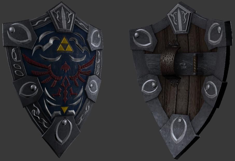
First off, Hello Polycount, and secondly, I made this thread to show off the progress of my making a Zelda game for CryEngine 3 in the form of game-ready models. Anyone else can share their zelda-based models if they so choose. To kickstart this off, here's my vision of the Hylian Shield...Modeled in 3ds max, textured in photoshop...
1-5.jpg

Replies

  • Di$array
    Offline / Send Message
    Di$array polycounter lvl 5
    Wireframe please!!!

    The front of the shield looks great but the back seems to be a bit bland. Maybe a more ornate grip would help As well as the scratched and scuffed edges to help sell it more. If you are looking for something more maybe even a hand painted photo of Zelda to push Link on when he's feeling the fatigue kicking in.
  • Overmind5000
    Offline / Send Message
    Overmind5000 polycounter lvl 11
    One wireframe coming up!
    1-6.jpg
    As for the scuffs and scratches, nothing a little photoshop magic can't do. Same with the ornate grip. Also I'll try to fix the blandness in the back.
  • Two Listen
    Offline / Send Message
    Two Listen polycount sponsor
    Those five detail things in the corners (the ones that are somewhat reminiscent of the Oblivion "O" logo) bother me a bit. It looks like they're some sort of evolution from the usual simple circle stud things that you sometimes see on the shield. I'm not sure why you've got the two upper most ones flipped opposite of all the rest. I think if you're going to do that you should also flip the bottom most one. That being said I'd think it'd look better if none of them were flipped at all.

    ...though, that being said, I don't actually think you need them at all. I think the thing at the very top point works, and the detail inlay inbetween all of them is ok. But I feel like my eyes are looking for some relief somewhere, and those corners I think would serve that purpose if left blank. I certainly don't think you need anything of that nature on the back side.

    I also think it's weird that your detail bits are a brighter color metal than the rest of it. Right now with the dark metal with those bright details on top of it makes the details look more pasted on. I think if you brighten up the darker metal (which makes up a majority of the metal on the shield) to match your detail shade, it will help bring it together much more. (If you do brighten up the metal, you could probably stand to brighten the wood on the back more as well.)
  • Overmind5000
    Offline / Send Message
    Overmind5000 polycounter lvl 11
    I took your suggestions into account, After some refining, I got a decent result. I scuffed up the corners after removing the "Oblivion" symbols, and adjusted the texture a bit...
    2-2.jpg
    Also, before my tablet pen broke, I was working on a vision of Majora's wrath, and this is what I had before it broke...
    EVIL.jpg
    Yes, I know it looks meaty.
  • Justin Meisse
    Offline / Send Message
    Justin Meisse polycounter lvl 18
    the shield is a little too high poly - edges that don't define a silhouette should be removed
  • CandyStripes05
    Offline / Send Message
    CandyStripes05 polycounter lvl 9
    not a fan of the scratches on the back of the shield... nor the front to be honest - perhaps revisiting your spec map (if you made one) would help sell it a bit more

    also the leather? arm brace on the back has way too much noise going on, tone it down a bit and make it feel like it belongs with the rest of the pieces on the shield : )
  • m4dcow
    Offline / Send Message
    m4dcow interpolator
    I agree with Justin, there are alot of extra polygons which aren't really doing anything for the asset.
  • ariofighter
    Offline / Send Message
    ariofighter polycounter lvl 13
    I know your using a 1k map, but your texture doesn't look like it. Especially with the uvs on some of it mirrored.

    Make sure the source that you get your base textures from is higher res, or else you will look like you have lower texture res even though your using a 1k.
  • Oniram
    Offline / Send Message
    Oniram polycounter lvl 16
    something maybe a bit more like this perhaps.. and so on and so forth

    wire.jpg
  • thefxguy006
    I am a huge Zelda nerd and I'm loving the assets so far, especially Majora's Mask. I've subscribed to this in hopes that you haven't given up on this project!
  • Overmind5000
    Offline / Send Message
    Overmind5000 polycounter lvl 11
    I've un-mirrored the UV's and reworked the texture. If there's any issues with it, please point them out.
    1-8.jpg
    Plus I reduced the polycount from 1,440 tris to 590. Thanks to Oniram for the advice. :)
    2-3.jpg
  • artstream
    Offline / Send Message
    artstream polycounter lvl 11
    Good job with the optimization. I think you can push your textures more. Add in some damage to where the shield would take most of the hits. Currently, your specular is pretty uniform, you'll want to break it up so that it really shines on areas that have been hit, and for areas that aren't going to be interacted with too much to not reflect as much light.
  • switz
    Offline / Send Message
    switz polycounter lvl 10
    I agree, great optimization! I would push the highlights on edges of the metal to make it pop abit more. Also I'd scale the mask on the Y-axis a tad; it should be wider than taller.

    200px-MajoraMask.png
Sign In or Register to comment.